
SAVVY.

TIMELINE
8 Months
(Undergrad Capstone Project)
ROLES
User Research,
Mobile App Interface Design,
User Testing,
Branding and Visual Design
TOOLS
CHALLENGE STATEMENT
How might we design a tool to help students better manage their student debt and set up payment plans that work for them?
the problem space
For the past two decades, tuition fees in Ontario have seen monumental rises. The affordability of tuition can be a deciding factor for whether a person chooses to pursue higher studies at all, and if they do, the resulting high expenses may force them to participate in high-rise work. These factors altogether may influence their performance in college, causing them major mental health issues.
opportunity for design intervention
Studies on financial stress among college students found that students debts are a major contributor of the same and also noted that most post-secondary students do not usually know the amount of debt they are in, and if they do, this amount comes out to be much higher that their expectation.
I set out to find out whether these knowledge gaps may, in fact, be contributing to stress, which could be substantially reduced by increasing students' awareness of their loan information and establishing a sense of control over their student loan repayments.

the design process
assumptions and biases
Some of my major assumptions that I intended to test the validity of through primary research were as follows:
1
Students lack awareness of the cost of their education and the exact debt they have incurred through it.
2
Students likely don't know what their repayment plans would look like.
3
Students likely don't know that they can set up their own payment plans.
4
The lack of this knowledge contributes towards increased stress and anxiety.
5
Students aren't taking the right measures to tackle the resulting anxiety.
1
How well is the OSAP Application Portal designed for the purpose of keeping students informed and educated on their loans?
2
What purposes are students using the OSAP portal for and how regularly do they check it?
3
How informed are students about their loans, amounts, repayment plans, etc?
research questions
Through my primary research, I aimed to find any knowledge gaps that exist in the space of student loans, attempting to find loopholes in the system that can benefit from a new product that will bridge any gaps in the experience.
4
What are the hopes and expectations of students regarding their loan repayment?
5
How is the lack of this knowledge impacting their life choices and their future goals?
research methods.
To find the right candidates, I spoke to some of my friends currently going to college, establishing that they need to meet these criteria to qualify as optimal participants for my structured interviews: they are full-time students, they are on OSAP and they plan on paying their loans through employment income.
1
Literature Review
2
Unstructured Interviews
3
Structured Interviews
4
Open Card Sorting
user personas.
I created some user personas using modified empathy maps to really understand the goals, needs and frustrations of my target audience.


Noteworthy responses from interview participants.

why an app?
The OSAP Dashboard is a website portal for students to see and change their loans and personal information. However, my participants complained about having to go through the process of two-step verification each time they log in to it. Some participants stated that they found this process to be annoying, considering that they may have to do it often in a certain time period to make sure the payments to the university have gone through in time.
1
The app increases easy of access to information and is handy for most students as they frequently use mobile phones.
2
Apps can use Face-ID to log in, eliminating the need for two-step verification.
3
Competitor debt-management tools are mobile apps, as well.
4
When considering the scalability of this product to accommodate different kinds of loan payments, apps are more handy and easy to frequently check.
5
May allow for easy connection to mobile banking apps.
iterating on the experience.
I went through multiple iterations to get to my final product. These included structural changes to the information architecture, an improved onboarding experience as well as a cycle of rebranding for positive visual impact of the content.
All design decisions that led to the final product relied on multiple rounds of user testing with my target audience. Being centred around financial educations, the product was developed under agile methodology, which involved constant collaboration with the main stakeholders (users).
In order to identify the most important use cases and find out the pain points of a user of my product, I mapped out the journey of one of my personas (Rebecca) and plotted her emotions on an empathy map combined with the user flow diagram.
user journey mapping.

creating the onboarding experience.
The goal for this phase was to design a friction-less sign-up experience that would set the user up on a positive journey through the app.
Using succinct and clear microcopy, the users will be given just enough information about the purpose and use cases of the app using the principle of progressive disclosure.
BUILDING TRUST.
Using this guide from UX Collective on UX writing for FinTech, the copy is written to be instructional and concise. This is achieved through the use of front-loaded sentences in the form of short paragraphs (from Cara Lam).
KEEPING THE USER INFORMED.
Using a form of progress bar that indicates the user where and how far from the completion they are in the sign-up process.
REDUCING THE INTERACTION COST.
Allowing the user to skip whenever they wish to do so is important because this will reduce loss of users due to a higher number of interaction (Joyce, Alita), based on this article by the Nielsen Norman Group.


prototypes.
My proposal, a mobile application that allows Ontario students on OSAP loans to stay on top of their student debt repayments after graduation. Users are expected to feel a sense of control over their finances by allowing students to modify their payment plans, schedule auto-deductible payments among other things, thus helping reduce the stress that comes with being in debt right after graduation.
During this iteration, the essence of the entire experience was concentrated on the Dashboard, which is the homepage of the app and gives the user an overview of their current payment plan, upcoming payments, percentage of loans paid off, etc. It uses different kinds of data visualizations to convey this information, like a line graph, a bar graph, a pie chart and a slider bar.


user testing and refinements.
The general feedback on the design and experience of the Dashboard was that there was excess of information on the one page and that was causing users to feel overwhelmed and overloaded.
Using the principles of chunking and progressive disclosure, a new experience was designed to cater to the needs of the persona (Rebecca).
After talking to some of the users about the primary purpose they would use this product for, these are the three major use cases:
-
To see how much they owe in total,
-
To see when the next payment is due, and
-
The amount of this next payment.
In an attempt to simplify the experience so as not to overwhelm the user, the Dashboard now only shows the graph that with only the percentage of the loan paid off. Any significant information with numbers and all the data visualization are now found on the Statistics page, when clicked on the View all Stats button.
CHUNKING OF INFORMATION
AFFIRMATIVE COPY
Further, in an attempt to remove any copy that had negative connotations or that the users would associate feelings of stress and anxiety with, the phrase "Debt Overview" was removed. Instead, the title of the page will simply read "Your Account".
OLD DESIGN

NEW DESIGN
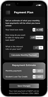
modifying payment plans.
This section of the app is heavily inspired by the UX of the OSAP websites Repayment Calculator, which allows the user to enter how long they'd like to take to pay their loan and tells them what their monthly payment comes out to be.
The OSAP website allows the all visitors to enter their total amount owed, however, with this being an application, users will already be signed in and so will not have to manually enter informations about their loans already present on their digital records.
Realistically, the only field users are able to input data into is the amount they'd like to pay each month. The number of months/years it'll take to pay off the full amount is not generally their concern, as most of my users said during testing. In the old design, the users were confused as to which field they can edit, however, two of the fields, the total amount owed and the interest rate, show auto deducted data. The number if months is calculated based on the users' desired amount.
ELIMINATING REDUNDANCY
In the new design, the user is able to view all the static information and only need edit the amount in the slider, based on which, they are shown the months and years they will be paying for.
EASIER AND FEWER CTAs

NEW DESIGN
OLD DESIGN
revised user flow for modifying
payment plans.
The complete user flow of the action of reviewing and revising a user's payment plan is shown below. When the user sees their upcoming payments from the home page, they may choose to revise this, which will show them a data visualization of their current plan, and a quick visual slider to see potential changes.
If they may still want to make changes, the next page shows them the open to slide to actually make changes, which still are not saved until they review and confirm this change on the next page.


I did considerable literature review that informed the design of my product at every stage. Information I found useful was indirectly verified to be aligned with the needs and goals of my users, which was then implemented into the design and found to be aiding the creation of an optimal experience through testing.
triangulation across research methods.
education components in
the experience.
At the centre of my design was creating to impart necessary eduction, while avoiding the use of financial jargon so that college students and new grads are able to use independently manage their loan repayments. They will be shown tips to create payment plans that works for them. They will also be shown information as to their interest rate if they wish to see it.
branding and visual design.
Savvy is an app, that is designed to be intuitive and efficient embodies a calm, fresh and welcoming personality. The blue theme is meant to create a positive and energetic environment.


the prototype.
A fully realized app, which begins with an informative onboarding, easing the user into the experience and walks through a complete user flow of reviewing and modifying a repayment plan.
what I learned.
Managing my own biases that might impact the direction of the development of this project was a crucial skill I learned. I did this by allowing for open-ended conversations with my users, asking follow-up questions during unstructured interviews and letting conversations flow more organically with them.
Constant collaboration with my users through multiple rounds of testing and iterating upon their feedback helped bring to life a product that satisfies the purposes of its users and their goals.